VALENTINE BY DESIGN
"I MEAN, THERE IS NO CAUSE FOR BREAKUP OR DIVORCE OVER THIS VALENTINE, BECAUSE I UNDERSTAND THAT A HAND-DRAWN HEART IS PERSONAL ENOUGH TO LOOK SUSPICIOUS. AFTER ALL, WHEN WAS THE LAST TIME SOMEONE ACTUALLY MADE SOMETHING FOR YOU? YES. INDEED. HAVE A HAPPY VALENTINES DAY AND DON’T EVER SAY NOBODY LOVES YOU."
Sometimes even the cheesiest, made-up traditions can create some really beautiful, well-loved design. Take Valentines day for example. Although our current, Americanized montages of red hearts and babies with wings are a far cry from the original meaning of the holiday, many creatives have chosen to feel the love, embrace the cheese, and be inspired by the heart shape that is shaped nothing like an actual heart.
LET’S LEARN FROM A FEW OF THE GREATS WHEN IT COMES TO LOVELY LETTERS, FLOURISHES & HEART SHAPED GOODNESS
MARIAN BANTJES
THE QUEEN OF THE VALENTINES
Marian Bantjes is well known for her unique, boundary-pushing design. When it comes to linework, pattern, and experimental type, she is incredibly talented and thinks well outside the realm of tradition. She is a great example of an artist who is quite adept at utilizing the ubiquitous valentine heart shape.
Although she has used hearts in a number of projects from her New York Times Square love fest banner design to the valentines heart she created for Saks Fifth Avenue in 2008, she also has been creating personal Valentines for years. This passion project has enabled Bantjes to experiment with different styles, print methods, and ways of personalizing valentines cards. From calligraphy, to laser cut paper, to linocut prints, it seems she has done it all.
Check out some of Marian’s valentines day work here:
2005 • 2006 • 2007 • 2008 • 2009 • 2010 • 2011 • 2012 • 2014 • 2015 • 2016 • 2017 & Her Ted talk on her Valentines
LOUISE FILI
SHE MAKES BEAUTIFUL LETTERS, ESPECIALLY FOR WINE & GELATO
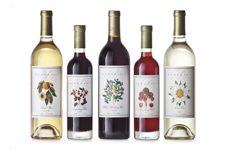
Louise Fili is nothing less than a legend when it comes to classic Italian lettering and feminine flourishes. Her technical precision and liberal use of the color red lend themselves well to a valentines-esque aesthetic. Not only has she designed and art directed for some renowned food brands (think gelato, cookies, wine and fruit spreads), she has also been involved in some pretty high profile brand refreshes, including Sarabeth’s and Good Housekeeping. Honestly, what goes better with romance than a little bit of Prosecco, pasta and pastries?
Check out some of Louise Fili’s beautiful packaging work HERE
Also, here are a few of my personal favorite Louise Fili designs that feature the color red:
Juliana’s Pizza • Marseille • Filaga Pizzeria • Paperless Post • SVA Masters Workshop Posters
JESSICA HISCHE
SHE DESIGNED THE LOVE STAMPS YOU PROBABLY USED FOR YOUR WEDDING POSTAGE
Jessica Hische has an extensive portfolio of beautiful and fun lettering work. Not only has she worked with a bajillion awesome clients you will probably recognize (see them here), she has also illustrated and published her own children’s book called Tomorrow I’ll Be Brave. Although she has quite a diverse portfolio, including book covers, retail pieces, editorial illustrations and tourism campaigns, she tends to have some truly dimensional and colorful styles of lettering. Oh, and she also designed those beautiful Love stamps that many of us have seen come in on wedding invitation envelopes…
It is clear that Hische’s work is created out of a great passion for design, and her love is present in many of her pieces. Check out some of her beautiful designs, in some particularly lovey context, here: Victoria’s Secret • Target Gift Cards • The Love Stamp • New York Times • HER OWN WEDDING INVITES #HeartEyes


