
Logos with Longevity
In the dynamic world of branding, a logo serves as the face of an organization, encapsulating its essence and values. As a brand strategist and designer, my aim for longevity in logo design is an intricate balance between current trends and timeless appeal. Here's a deep dive into the factors that contribute to the enduring power of a logo, standing the test of time and resonating with audiences for years to come.
Simplicity and Clarity:
The timeless adage "less is more" holds true in logo design. Simple, clear, and uncluttered logos have a timeless quality that can transcend the trend cycle. A logo should communicate the brand's identity swiftly and memorably, making simplicity a key ingredient for longevity.

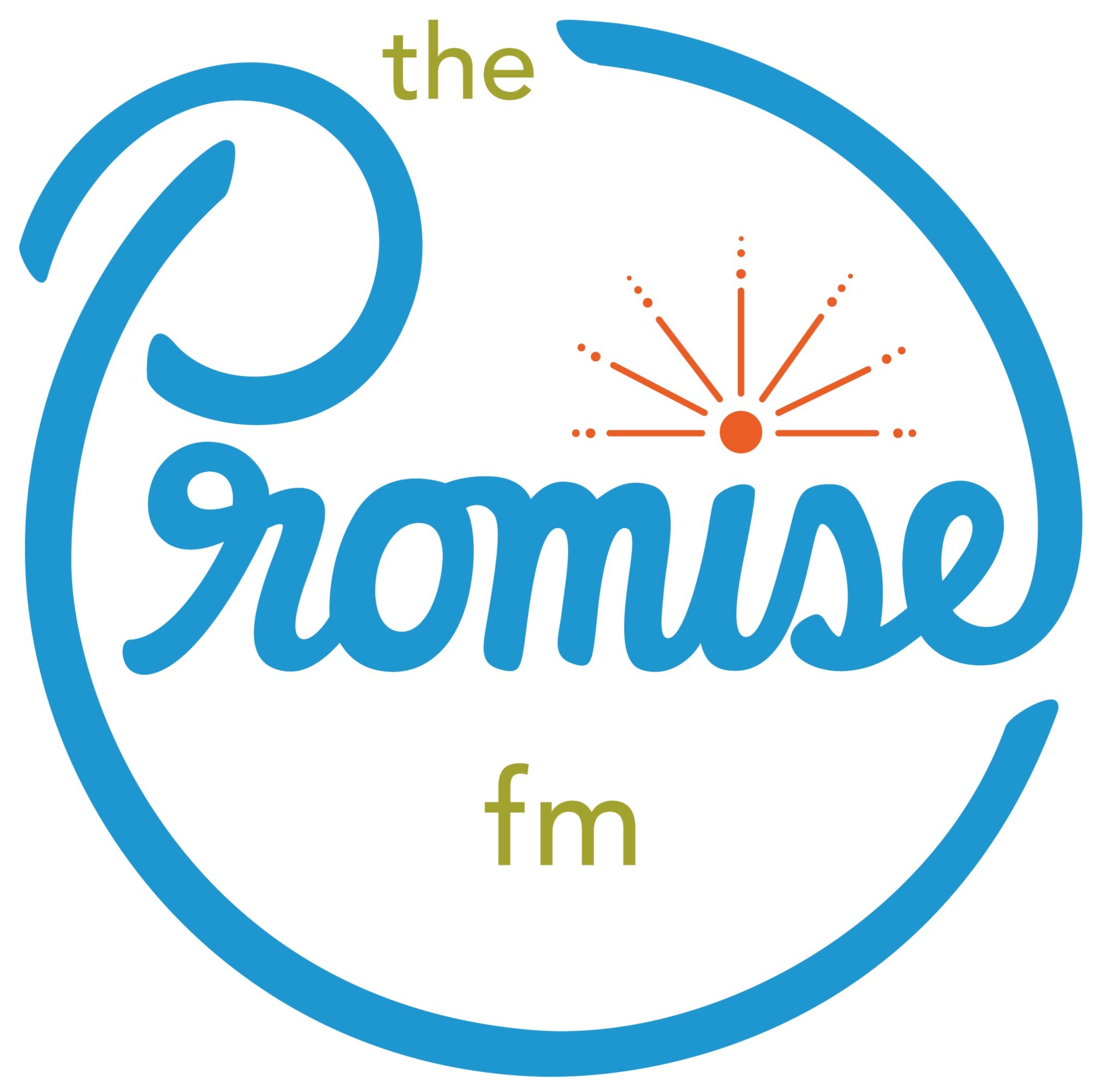
The Promise FM
We designed the new logo for The Promise FM in 2015 as a replacement for a listener-designed logo that was done previously that had won their logo design contest.
Having stood the test of time now for 9 years the logo is still a recognizable and equitable landmark of a brand that exists across Northern Michigan.
Versatility Across Platforms:
As technology evolves, so does the way we interact with brands. A logo designed for longevity should seamlessly adapt to various platforms and mediums, from traditional print to digital applications. Ensuring scalability and clarity in different contexts enhances a logo's endurance.

Primary & Secondary
Have two different logo versions (one a square shape and one a rectangle) is a good example of creating versatility in logo design for multiple applications.
Meaningful Symbolism:
A logo becomes timeless when it goes beyond mere aesthetics and incorporates meaningful symbolism. Symbols that encapsulate the brand's values, ethos, or story have a lasting impact. Such logos resonate with audiences on a deeper level, creating an enduring connection.

Radio Waves
We used simple lines and circles to symbolically represent traveling radio signals, communicating the idea simply and effectively.
Adaptability to Trends:
While striving for timelessness, a logo should also possess a degree of adaptability to contemporary design trends. Elements that can be subtly refreshed or adjusted allow a logo to stay relevant without losing its core identity. The key is to embrace evolution without compromising the essence of the brand.
Color Harmony:
Color often plays a pivotal role in logo design, and a harmonious & simple color palette contributes to a logo's longevity. Timeless logos often feature colors that evoke emotions consistent with the brand's identity. Avoiding overly trendy or seasonal colors ensures the logo remains visually appealing across different eras.

Bright and Visible
The colors we chose for The Promise FM’s logo & brand are based on the hopeful and encouraging nature of the radio station. It’s also incredible recognizable amongst other brands at events, concerts and festivals.
Typography Choices:
Typography is at the core of many logos, and influences its readability. Opting for classic and legible fonts or letterin ensures a logo’s ability to stand the test of time. When typography is an integral part of the logo, timeless typefaces that convey the brand's personality consistently are key.

Hand Lettering + Typography
Combining a timeless sans serif like Avenir (designed by Adrian Frutiger in 1987) with custom, hand-lettered script reveals the contrast between the organic & handmade and the geometric & structured.
Scalable and Time-Resistant Details:
Intricate details may lose their impact over time or become challenging to reproduce in various sizes. A timeless logo incorporates details that are both scalable and resistant to the passage of time. This ensures the logo remains recognizable and impactful across different applications.
Consistency in Branding Elements:
A logo is part of a larger visual identity system. Consistency in branding elements, such as imagery, shapes, and messaging, contributes to a cohesive brand image. A seamless integration of these elements within the logo itself provides connection as it remains the symbol of the brand.

The Holistic Brand
The Promise FM’s logo is of course a part of a larger brand that is consistent in its shapes, colors, imagery and messaging. The logo is effective because it is a part of the brand ecosystem, not because it is independent of it.
Enduring Relevance:
A logo designed for longevity possesses an inherent relevance that withstands cultural shifts. Focus on a brand's essence and the evergreen aspects of its identity allows for a logo that remains relevant and resonant with evolving audiences.
Clarity of Purpose
This logo, because it is clear, readable and represents a hopeful message, has continued to be relevant to a constantly changing audience of listeners & donors.
User-Centric Design:
A timeless logo considers the end user's experience. It should be easily recognizable, memorable, and evoke positive associations. User-centric design ensures that the logo becomes a memorable symbol ingrained in the minds of the audience over time.
In the ever-changing landscape of brand strategy and design, the pursuit of a timeless logo is an artful blend of tradition and innovation. As a brand strategist, I rely on a deep understanding of the brand's essence, a keen eye for design principles, and a foresight that anticipates the evolving tastes of audiences to craft these long-lasting logos.
Are you ready to create a legacy? Book a brand consultation and we can start creating your perfect logo.