Your Guide to Color
Color surrounds us in every facet of our lives, influencing our moods, perceptions, and preferences. While the study of color theory is easily associated with art and design, its impact extends way beyond those visual mediums. Whether you're choosing colors for your home, planning your wardrobe, or simply choosing a nail polish color for the next 3 weeks, a basic understanding of color theory can be a powerful tool. Let’s talk about a basic knowledge of color theory can enhance your life (and get my free color theory mini-guide!)
Creating Harmonious Environments
In the realm of interior design, understanding color theory allows you to create harmonious and visually pleasing spaces. Knowing which colors complement each other and how to balance warm and cool tones can transform a room. Listen, I know some of you will say you LoOooOoVe beige. Or you are a neutrals girly. Trust me, color is good for you! Whether you're selecting paint colors, furniture, or decor, a simple grasp of color theory means that you can ACTUALLY add some color into your life (even if it is earthy) and create an even more cohesive and inviting space.
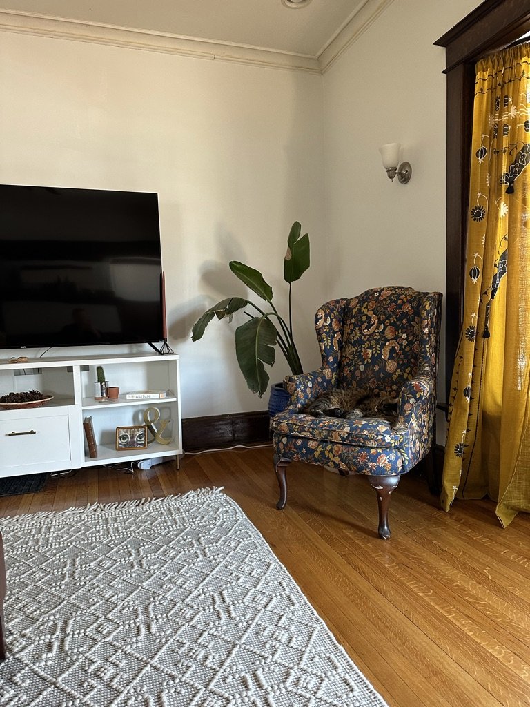
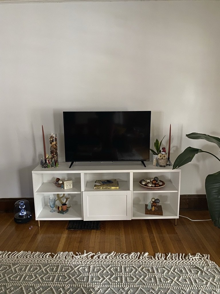
I have a simple example of color theory put into practice right in my living room! The previous owners of our 100 yr old home refinished the oak floors to have a very warm honey hue. By painting our walls a very cool white, I was able to balance out the warmth of the floors to create a much more balanced space!
Examples of where to consider color theory in your home:
Rugs, curtains, blankets, pillows & other textiles
Paint colors!!
Wood tones
Furniture finishes
Appliance finishes
Old Living Room Colors
New Living Room Colors
Expressing Personal Style
Your wardrobe is a huge opportunity for expression (whether you like it or not) and your choice of color is a big part of that. A basic understanding of color theory can help you take outfits you like and style them into outfits you LOVE and make you feel your most confident. Knowing some color theory and your color season can help you know whether to aim for a bold, contrasting look or a subtle mix of complementary hues. I get it, black is classic, but believe me when I say you will definitely look amazing in some color too.
A good example of color theory in trending fashion right now is MONOCHROME. Matching sets are huge in fashion and everyone loves a good color block moment.
Examples of how to consider color theory in your wardrobe:
Using color blocking to create balance from head to toe
Pairing neutrals with pops of color
Learning your color season to make sure your clothing and accessories compliment the natural coloring of your hair, skin and eyes
Wearing colors you like and that make you happy ❤️
Making Effective Visual Communication Choices
Color plays a pivotal role in visual communication (and setting the VIBE). From creating impactful presentations at work or simply curating a beautiful blog or social feed, knowing how to use color effectively gives you the ability to convey information and emotion in a really impactful way. Considerations such as color contrast, readability, and the psychology of color can significantly elevate the impact of whatever imagery you are using, making your message more engaging and memorable.
A good example here is using color to make your blog stand out! Using consistent color palettes or palettes that compliment each other can make your blog or website recognizable to your audience.
Examples of how to use color theory in your content:
Considering the palette of the photos or videos you are sharing
Deciding on a consistent palette of colors you will use in graphics you are using
Using brand color palettes when presenting to or for a company or brand
Navigating Branding, Marketing or Affiliate Decisions
Even if you're not a marketer or designer, understanding color theory can be invaluable when making branding and marketing decisions. Colors evoke emotions and convey messages, influencing how people perceive products or services. Whether you're choosing a color scheme for a personal project or contemplating the branding of a small business, an understanding of color theory empowers you to make choices that resonate with your audience.
Color definitely conveys emotion and meaning in society. Typically we recognize (in Western culture) that red is an intense or emotional color, blue is soothing or calming, green invokes nature, and yellow and orange are energizing colors!
Enhancing Productivity and Inspiration for Work
With the rise of remote work, many individuals find themselves designing home offices. Color theory can play a crucial role in creating a workspace that enhances productivity and well-being. Cool tones such as blues and greens can evoke a sense of calm, while warm tones like yellows and oranges can stimulate creativity and energy. Applying these principles to your home office can contribute to a more conducive work environment.
A good way to include helpful colors in your home office, or even home gym, is to focus on colors that inspire you or make you feel more creative. This can be different for everyone, but is a great opportunity to get a little more personal with the colors in your space.
Examples of how to use color theory in your home office:
Paint your walls a color that helps you stay calm and focused
Add textiles that are comforting and give you a sense of balance
Use colors that give you joy, inspiration or make you feel more creative in simple places: your wall calendar or decor, your laptop sleeve, your pens or your office chair.
Navigating Simple, Everyday Decisions
Beyond specific design applications, understanding color theory provides a framework for making little, everyday choices with a sense of confidence and enjoyment! Anything from deciding on the color of your car or selecting a gift wrapping scheme for a friend to simply buying new curtains for your living room can be made so much simpler by understanding color.
Simple places you will find color theory comes in handy:
Selecting nail polish, jewelry, or accessories
Choosing a balloon color for a party
Picking out a new pair of glasses
Putting together a charcuterie board (I am dead serious)
Styling a shelf or gallery wall
Picking out new bedding
Color coding your planner


